BETTY BRADER
CONCEPT
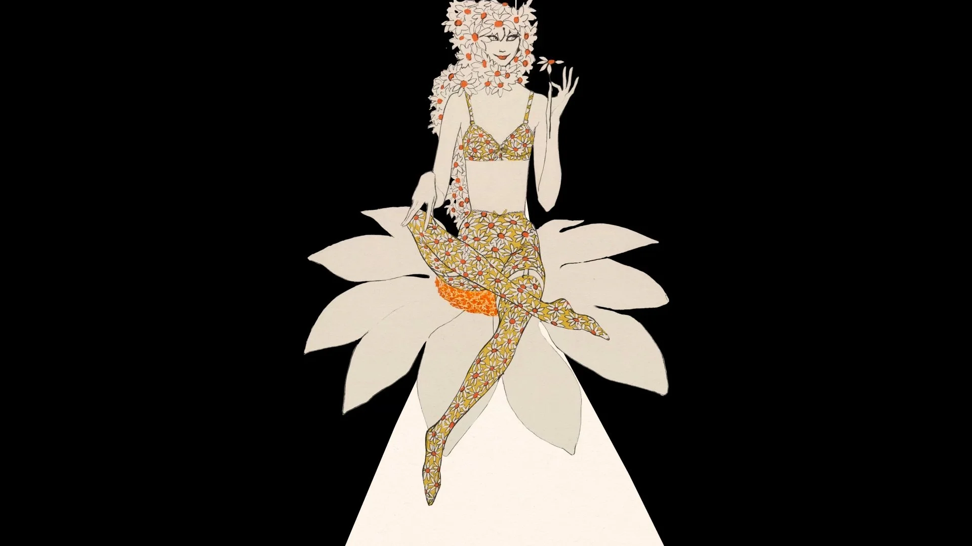
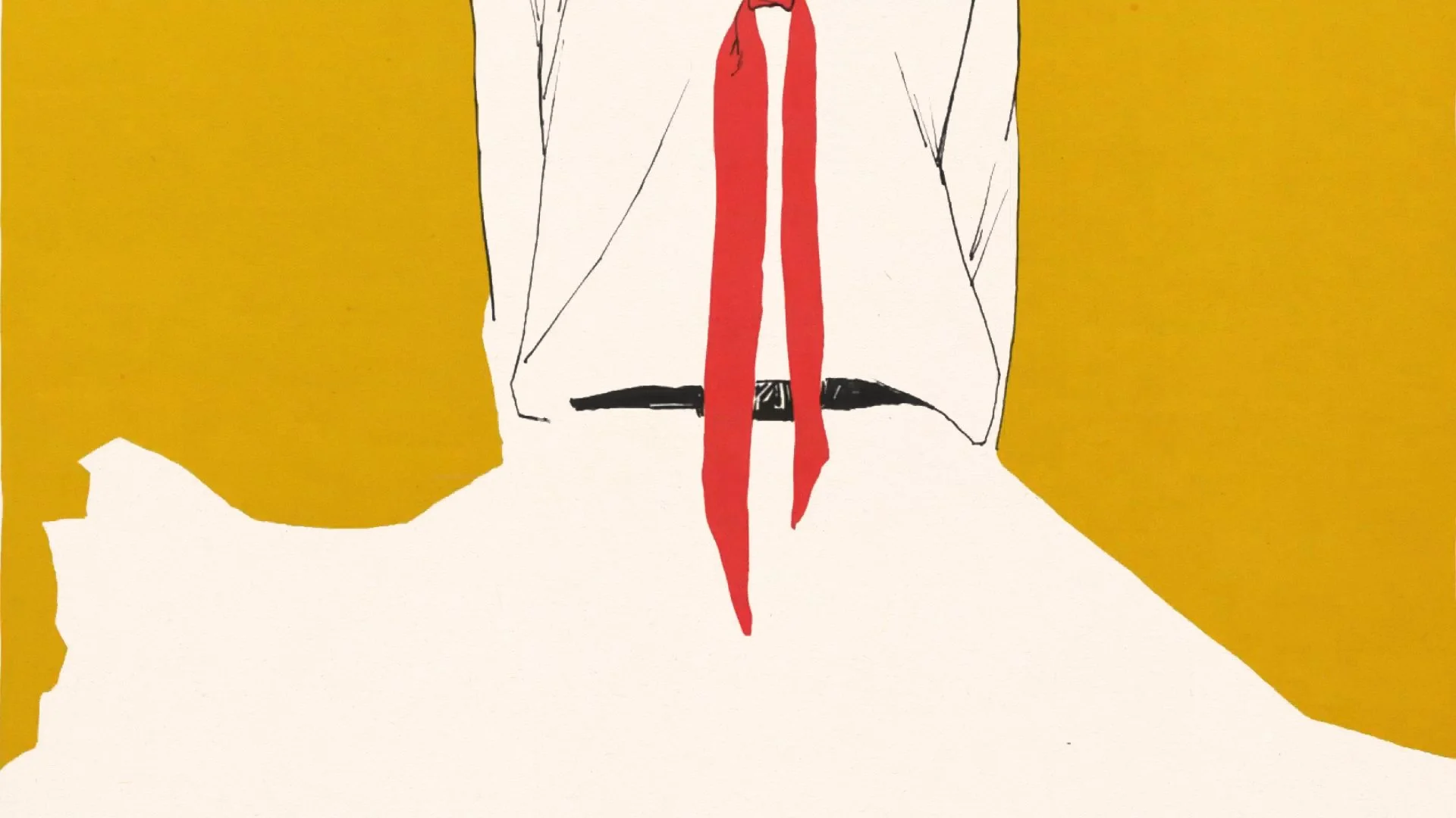
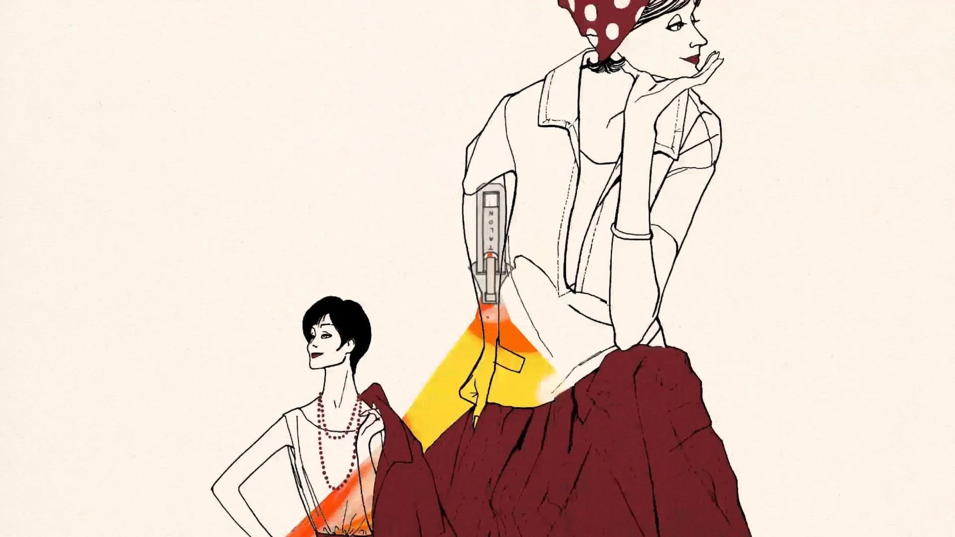
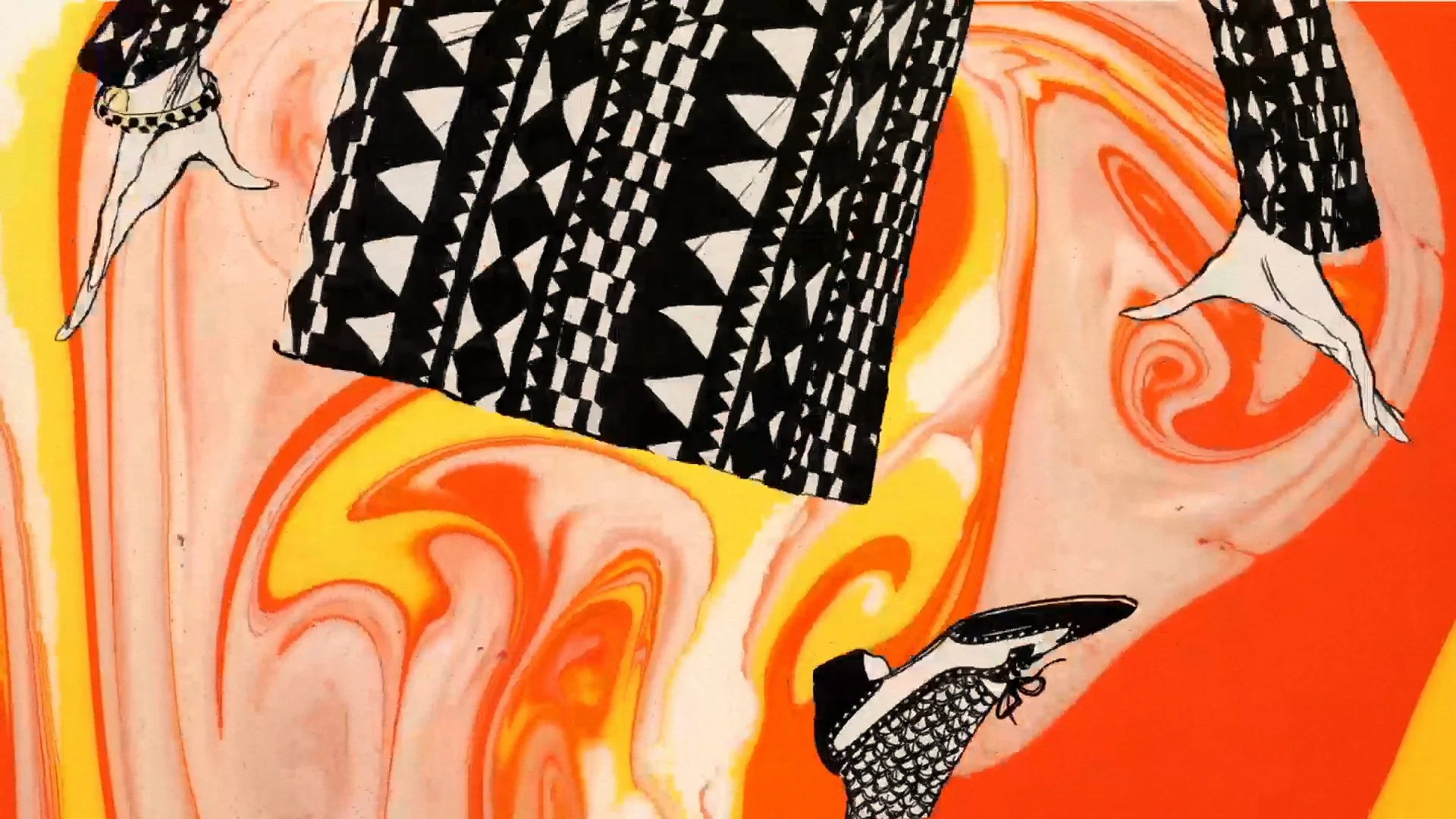
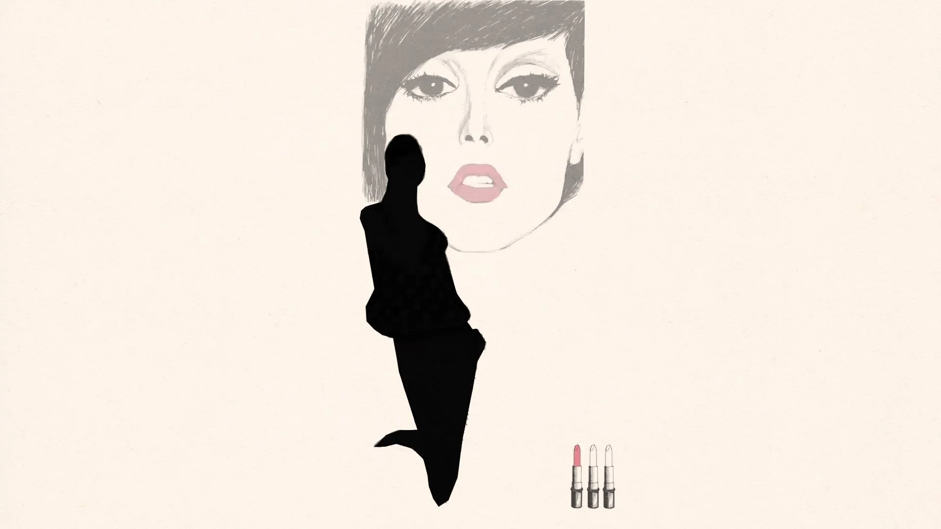
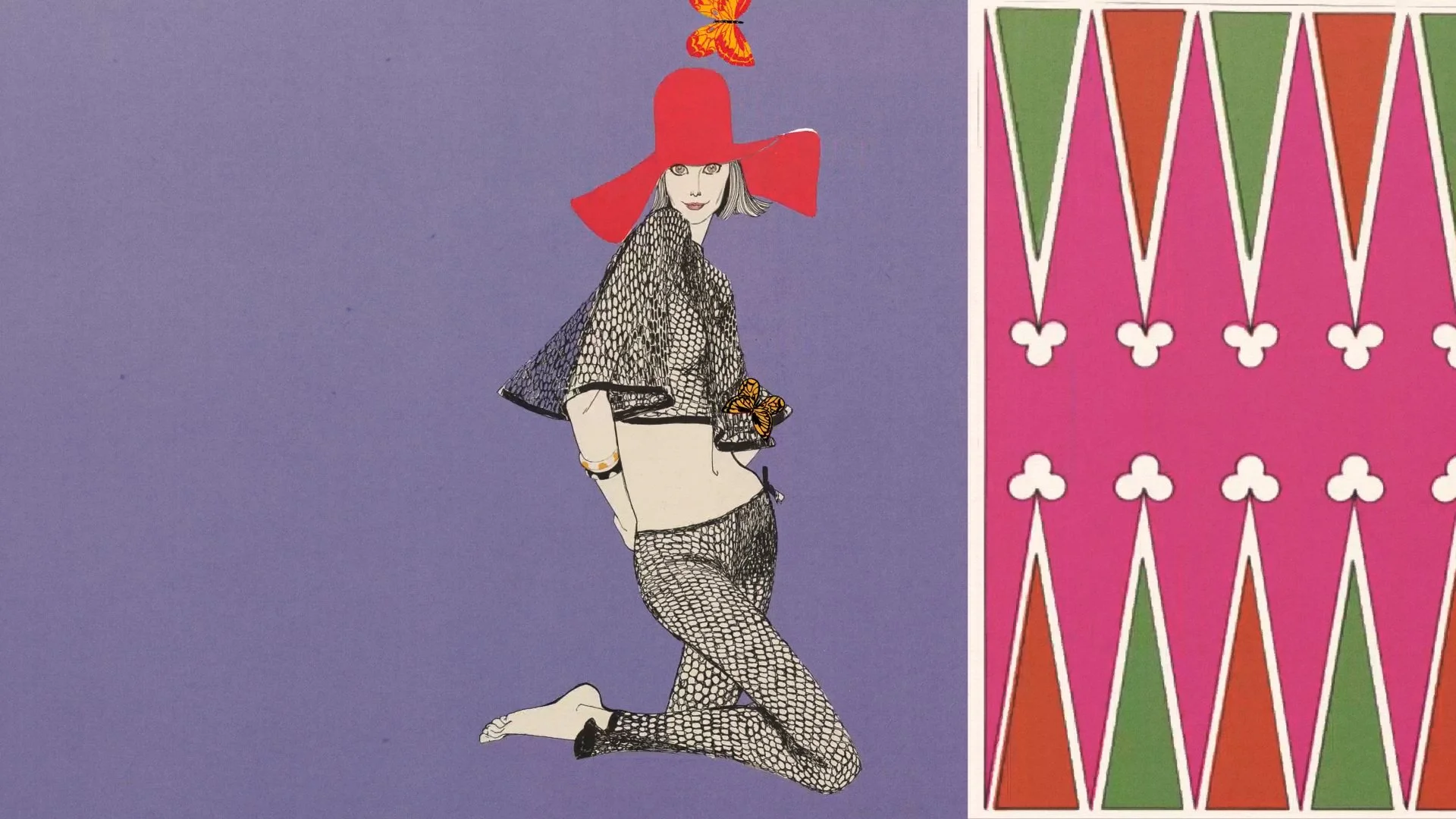
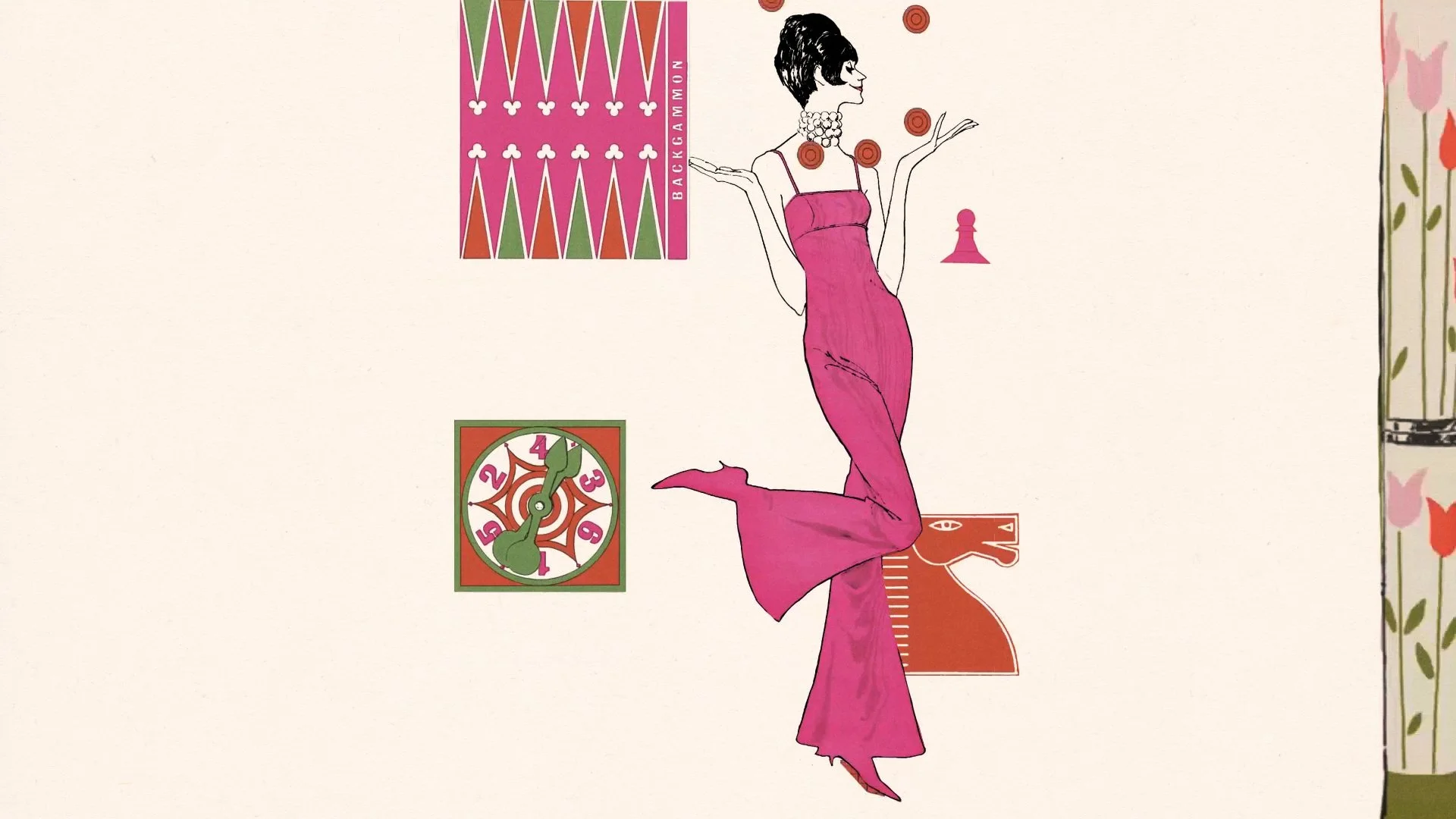
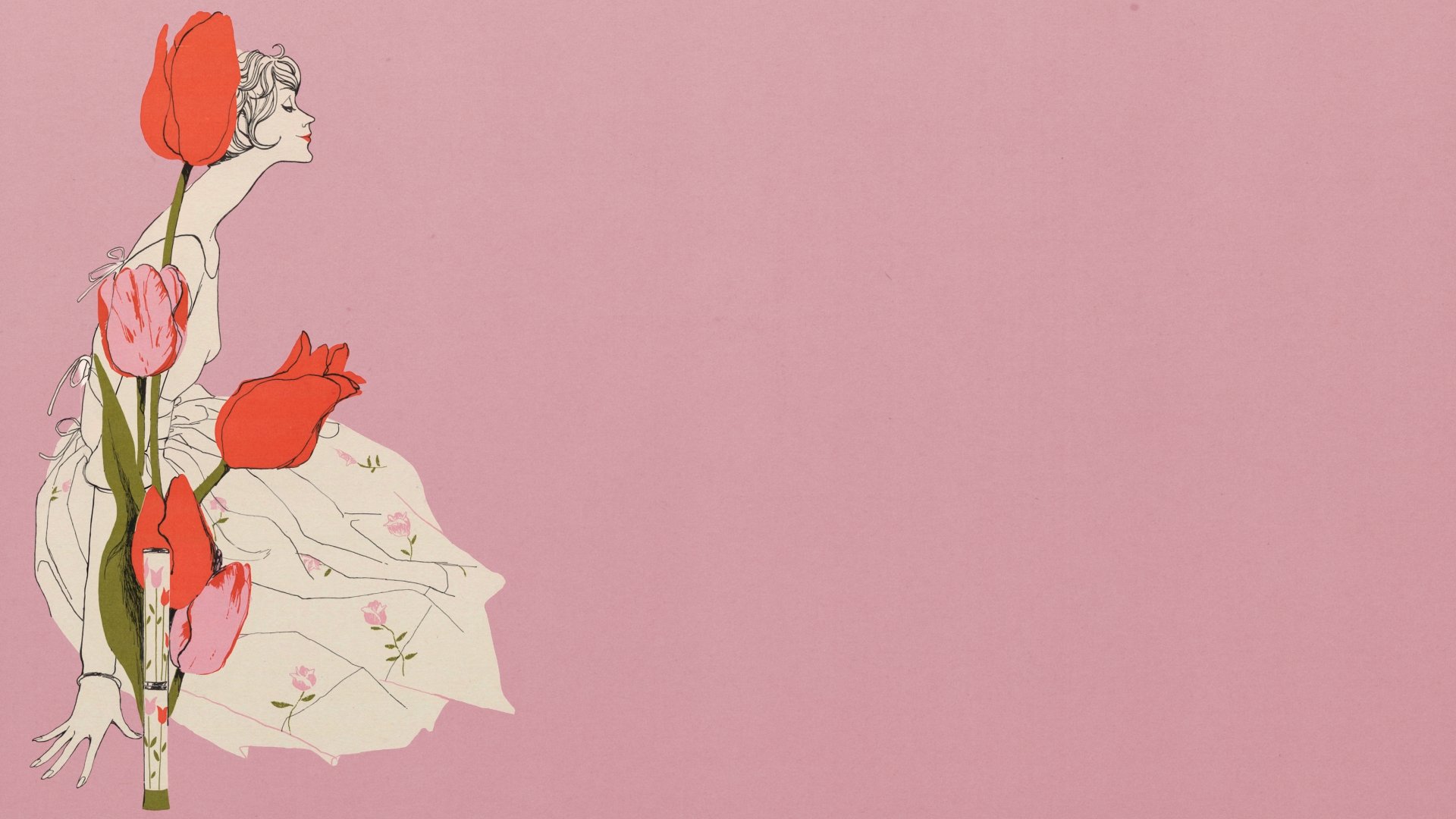
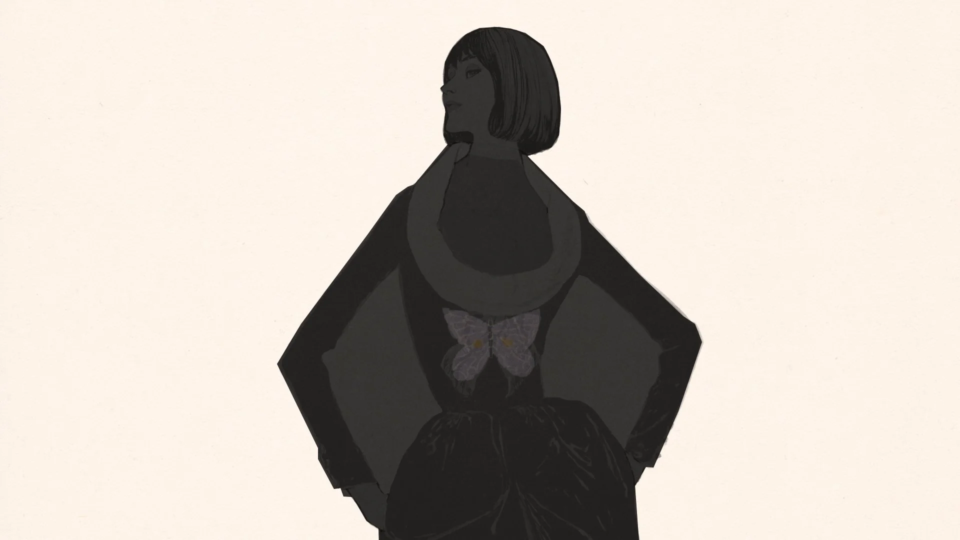
While researching Southern Californian icons, I came across Betty Brader, a prominent figure in Southern California's fashion industry during the 1960s. I found her story quite interesting, as she won awards and had famous clients such as Joseph Magnin and Neiman Marcus for her illustrations. However, despite her achievements, her name and face are not widely recognized. It is crucial to elevate and give more prominence to the stories of women like Betty, whose contributions have been nearly erased over time. Using limited resources, I created an animated collage of advertising illustrations from Betty's peak period as a tribute to her work at Joseph Magnin.
STORY
Betty Brader was an American fashion illustrator known for revolutionizing fashion advertising in the 1950s and 1960s. She created influential graphic posters and newspaper advertisements for the San Francisco-based chain Joseph Magnin Co., shaping the store’s image. Her work was widely imitated, and she left behind a significant collection of posters at the Smithsonian Institution’s National Museum of American History when she passed away on December 14, 1986.
MOODBOARDS
INSPIRATIONS
REFERENCES
Original Work References
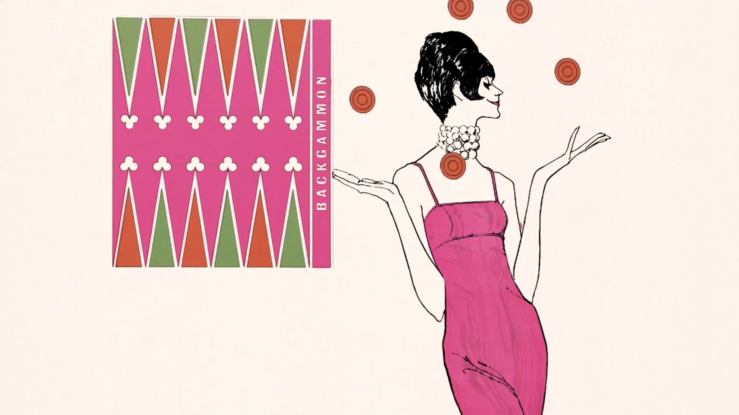
I sorted Betty's Joseph Magnin illustrations into three categories: merchandise, event/seasonal posters, and fashion catalog drawings, which are available in the Smithsonian Digital Gallery. Her collection features diverse layout styles and color schemes, showcasing two-figure compositions, bold gestures, and striking graphic patterns known for their unique and optimistic spirit. Brader's stylized figures attracted Joseph Magnin customers in a personalized way, without relying on sales copy.
Moodboard
I created a mood board that captures Betty's artistic style based on her collection of illustrations. Her style features clean, slick, and bold lines, and she uses characters as both positive and negative space in her works. This technique is evident in her character designs and her use of typography, serving both decorative and informative purposes.
Colors and Patterns
To create a relevant design and color scheme today, it's important to research the popular patterns and colors of the 1960s. This is particularly crucial for understanding Betty’s work from that time. The goal is to recreate a contemporary interpretation of the 60s, rather than simply copying what already exists.
Editorial Collage Inspiration
I took inspiration from the colorful and bold editorial works of the 1960s. As I delved deeper into my research, I found interesting ways to simplify my collage idea while still capturing the vibrant style of that decade. I also incorporated this editorial look in conjunction with the color palette to determine the shape and compositions of the cutouts for my collages.
Negative Space Motion
I drew inspiration from modern illustrations, gifs, and logo reveals to help me determine the timing and transitions between each scene, rather than replicating the style of a specific decade.
Decade Industry Research
I spent extra time researching the fashion, retail, and merchandising industry of the 1960s to better understand how things were marketed and how Betty made her design choices at the peak of her career. I believe this research is necessary as it will help me to understand and appreciate the art direction layouts from a broader perspective. This allows me to add modern and new features into something that is already very saturated in color and style.


